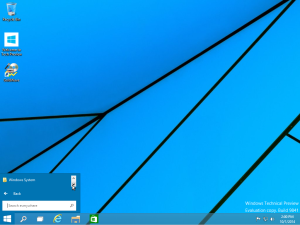
Well, Microsoft has decided to skip Windows 9 altogether and jump to Windows 10. Could it be that they are so ashamed of Windows 8 that they wanted to separate themselves from it? Is it that they think they’ve finally got a “perfect 10”?
I installed the preview and must say, it feels a lot more like the old desktop paradigm, but the start menu is still garbage. At least in the first preview.
Seriously?
Yeah… let’s look a little closer…
Yep: I’ve got a single line where each “app” appears, and an up/down button to allow me to flip through them.
I’m guessing this is a glitch, or a bug, or an oversight, but you’d think they would have gotten the one selling point right. I mean, anyone who hates Windows 8 for the “start screen” is testing Windows 10 specifically to see if Microsoft got it right.
They didn’t.
Not even close.
But hey, Goldwave installed and runs well! Good thing it adds an icon to the desktop since I don’t want to have to scroll down to “G” one line at a time, let alone a program starting with X, Y or Z.
-Robbie


